Dashboards
Field notes
Public-data work, rebuilt natively on the site. Questions I chased for their own sake — happiness, economics, mobility, odd corners of history — followed where the data led. Interactive, reskinned to the house style, not embedded in an iframe.
Pick a dashboard
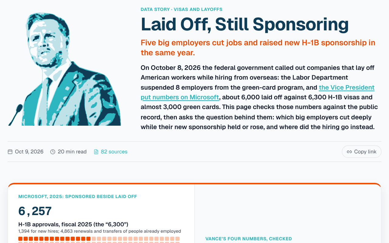
Laid Off, Still Sponsoring
Economics
The government called out firms that lay off Americans and hire overseas. Who actually did both.
- Published
- Oct 9, 2026
- Views
- —
- Origin
- Native
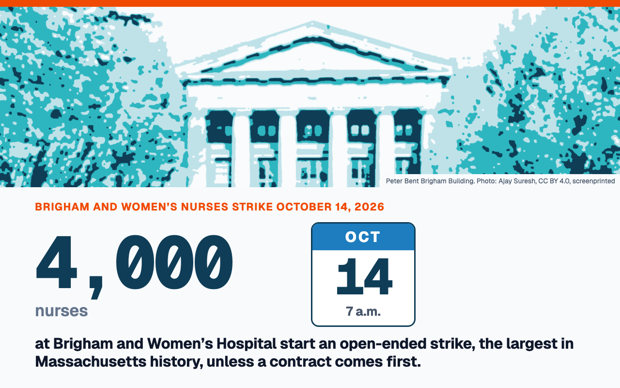
Less Than Inflation
Economics
Brigham nurses strike October 14 for a raise under Boston’s inflation. Mass General Brigham offers 0% across the board.
- Published
- Oct 9, 2026
- Views
- —
- Origin
- Native
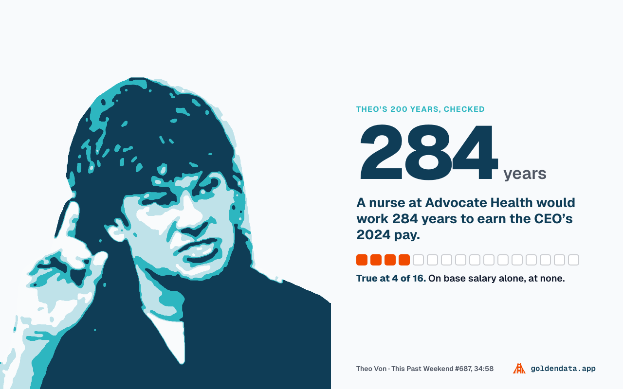
The 200-Year Nurse
Economics
Nurse pay vs. hospital CEO pay: Theo Von’s 200 years, checked against 16 filings.
- Published
- Oct 3, 2026
- Views
- —
- Origin
- Native
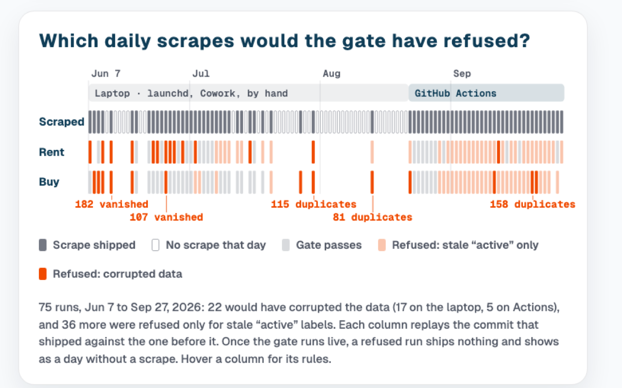
The Scrape Gate
AI & agents
Every scrape since June replayed through the gate that refuses bad runs.
- Published
- Sep 27, 2026
- Views
- —
- Origin
- Native
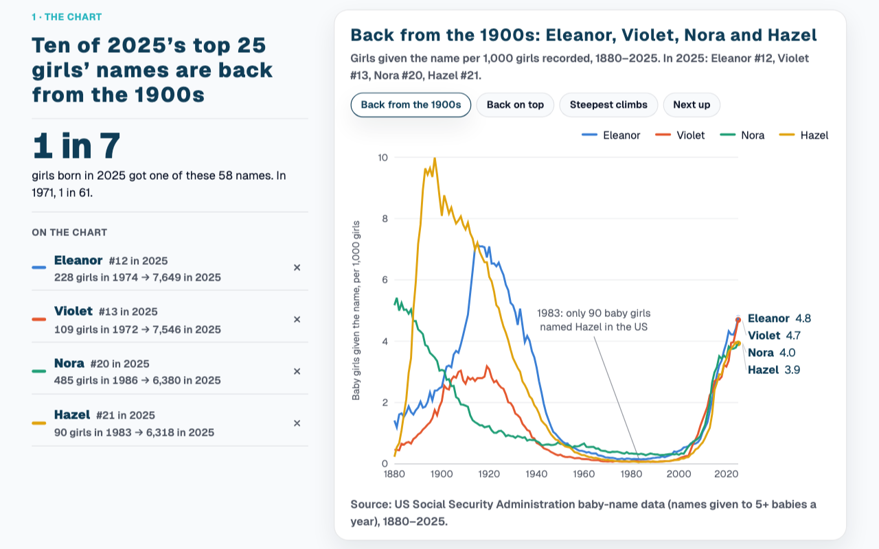
Back from the 1900s
Population
Hazel, Violet, Theodore and 81 more names that nearly vanished and came back.
- Published
- Oct 10, 2026
- Views
- —
- Origin
- Native
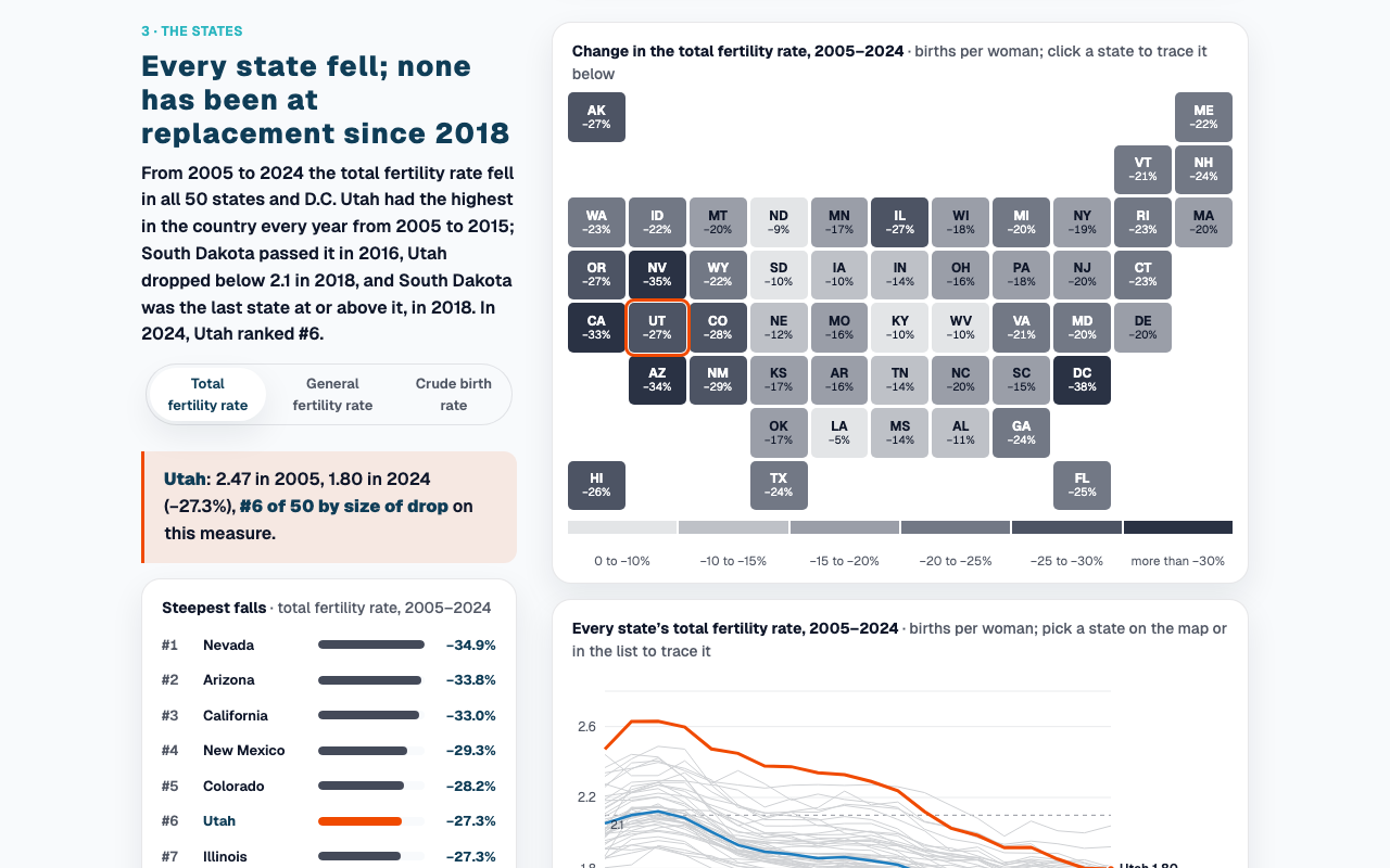
Below Replacement, Even in Utah
Population
Fifty states below replacement, and why Utah fell furthest.
- Published
- Sep 27, 2026
- Views
- —
- Origin
- Native
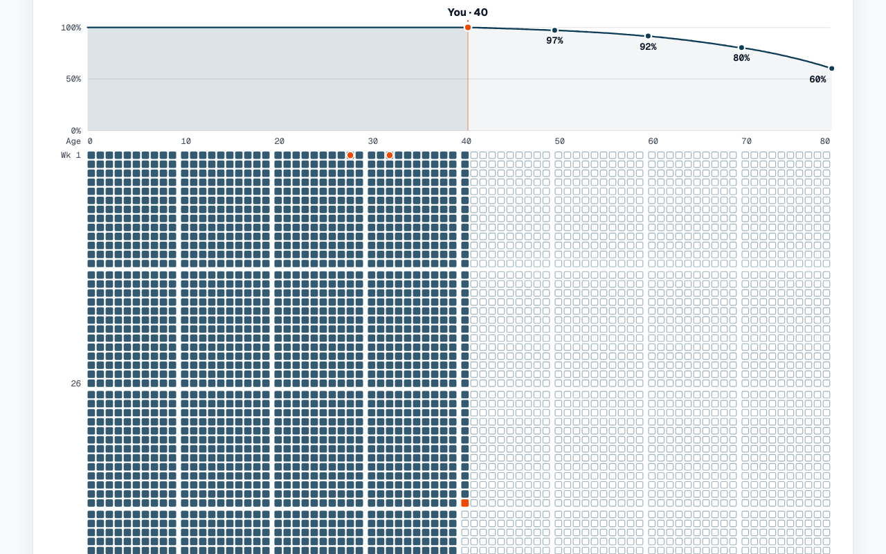
Four Thousand Weeks
Wellbeing
Your life in weeks, your odds of reaching each age, and who gets the rest.
- Published
- Sep 22, 2026
- Views
- —
- Origin
- Native
 Work in progress
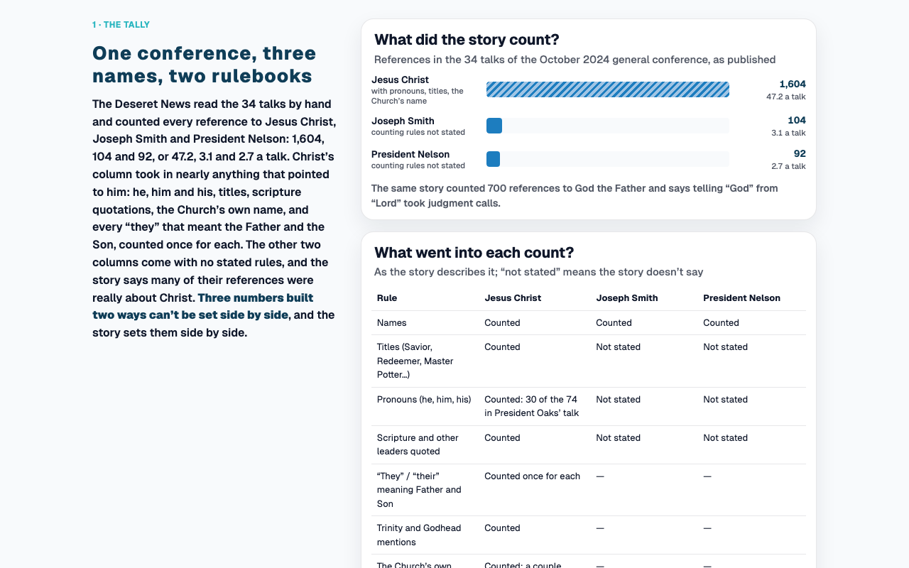
Counting Christ
Faith
A newspaper’s tally of 1,604 references to Christ, checked line by line.
- Published
- Sep 27, 2026
- Views
- —
- Origin
- Native
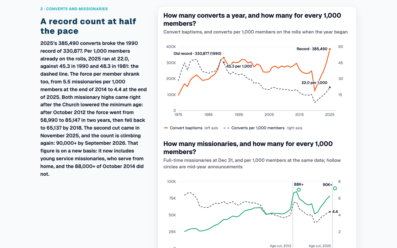
50 Years of LDS Growth: Record Counts, Not Record Growth
Faith
Every record conceded, then set beside the per-member rates that halved.
- Published
- Sep 22, 2026
- Views
- —
- Origin
- Tableau
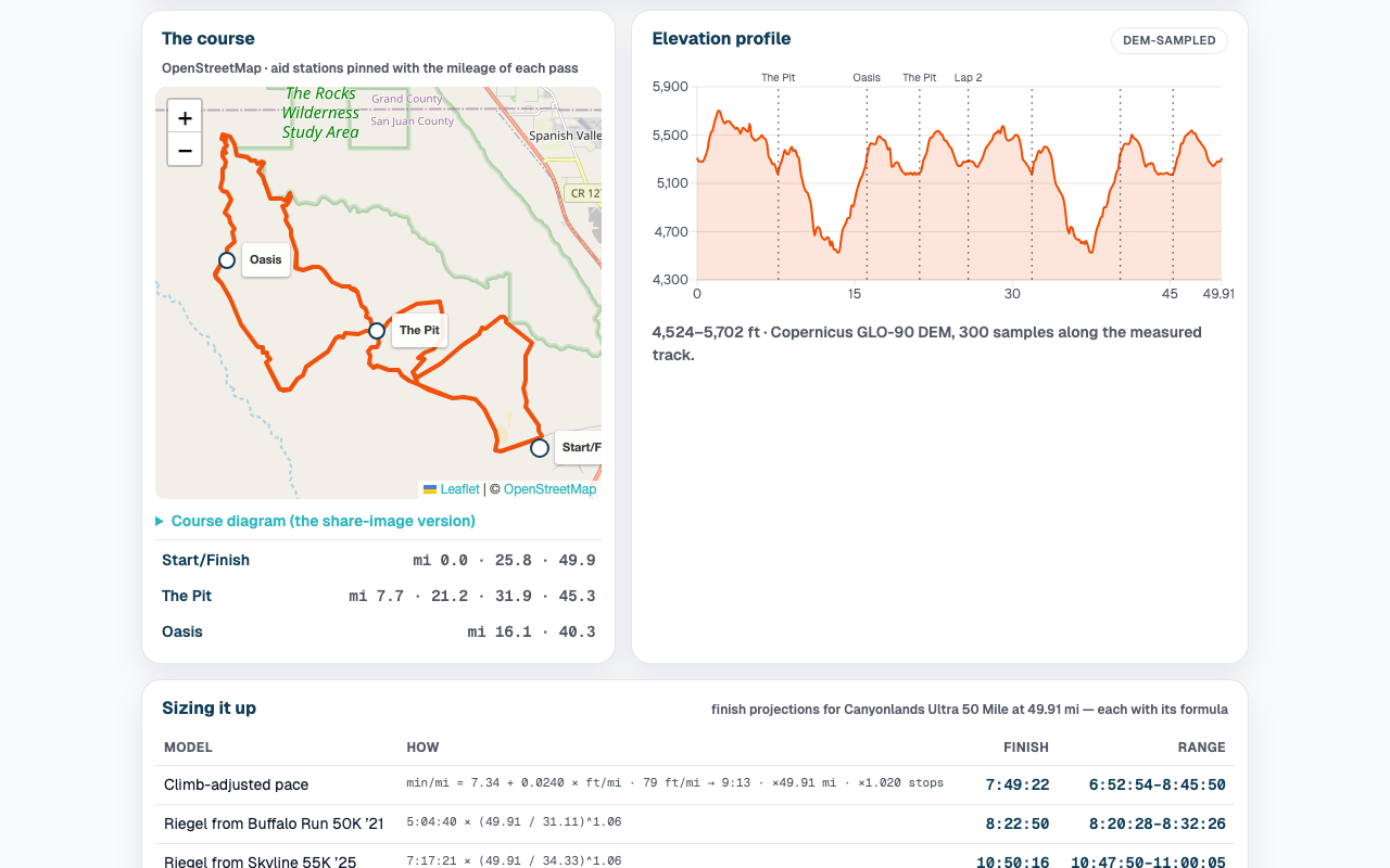
Past Thirteen Miles
Personal data
Every long run since 2020 from Strava, and the ultras sized up one by one.
- Published
- Sep 13, 2026
- Views
- —
- Origin
- Native
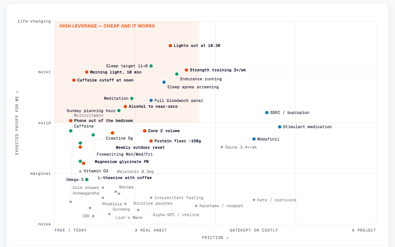
Leverage Map
Wellbeing
Interventions plotted by friction against payoff: doing, next, noise.
- Published
- Sep 7, 2026
- Views
- —
- Origin
- Native
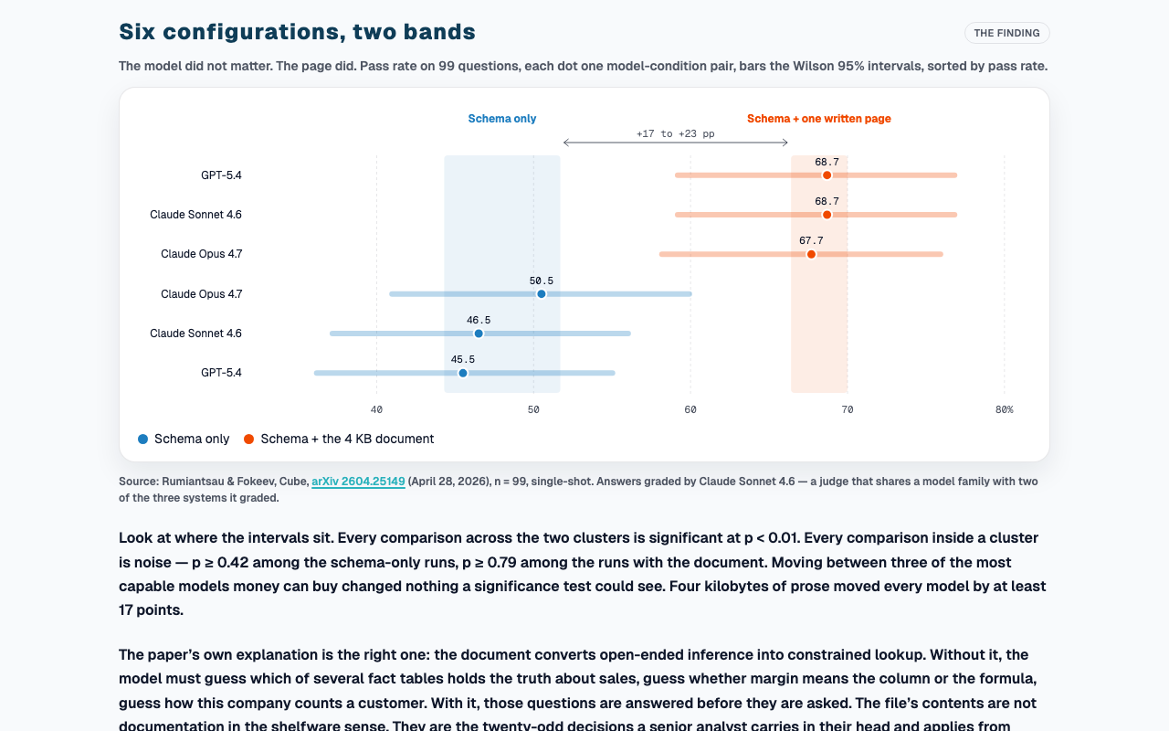
The Page Was Worth Twenty Points
AI & agents
One written page was worth 17 to 23 points of accuracy; the model, nothing.
- Published
- Aug 27, 2026
- Views
- —
- Origin
- Native
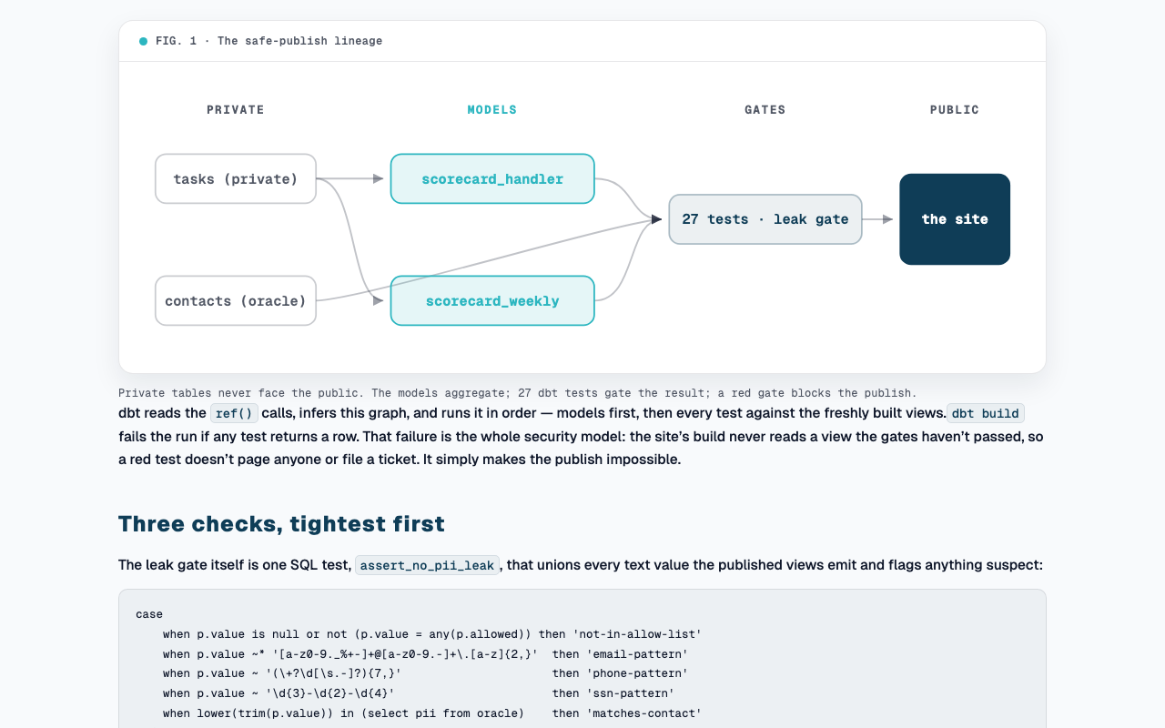
The Leak Gate
AI & agents
The dbt layer that publishes my task log’s totals and none of its titles.
- Published
- Jul 24, 2026
- Views
- —
- Origin
- Native
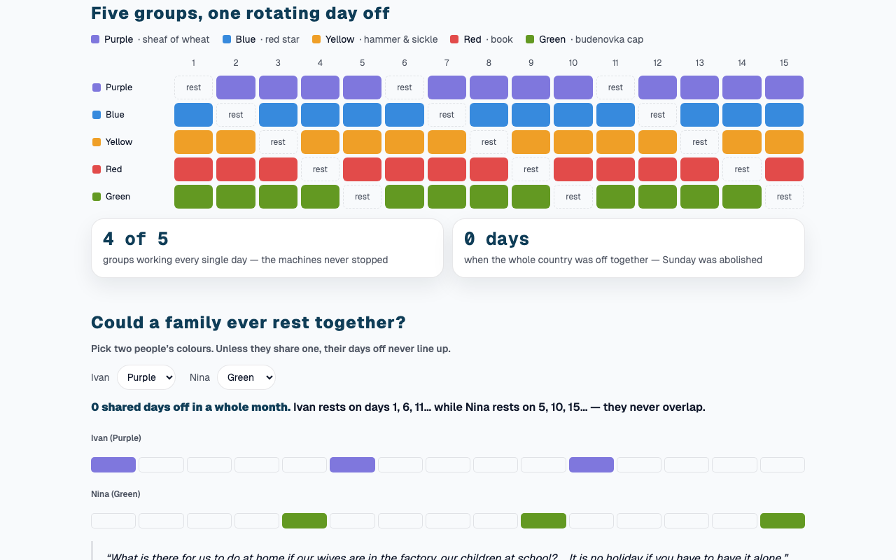
The Week That Had No Weekend
History
The Soviet week with no weekend: five colour groups and no shared day off.
- Published
- Jul 8, 2026
- Views
- —
- Origin
- Native
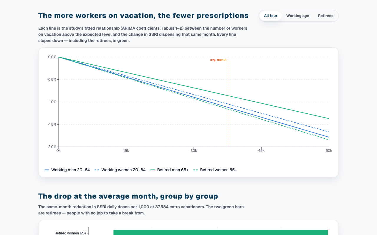
When Sweden Vacations Together
Wellbeing
The more Swedes vacationed at once, the fewer antidepressants went out.
- Published
- Jul 8, 2026
- Views
- —
- Origin
- Native
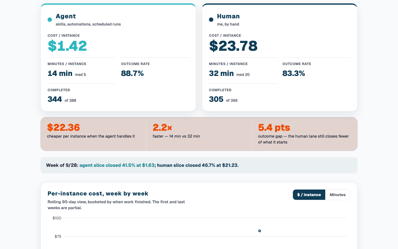
The Agent-vs-Human Scorecard
AI & agents
Agent versus human on my own tasks: outcomes, dollars and minutes, 90 days.
- Published
- Jul 8, 2026
- Views
- —
- Origin
- Native
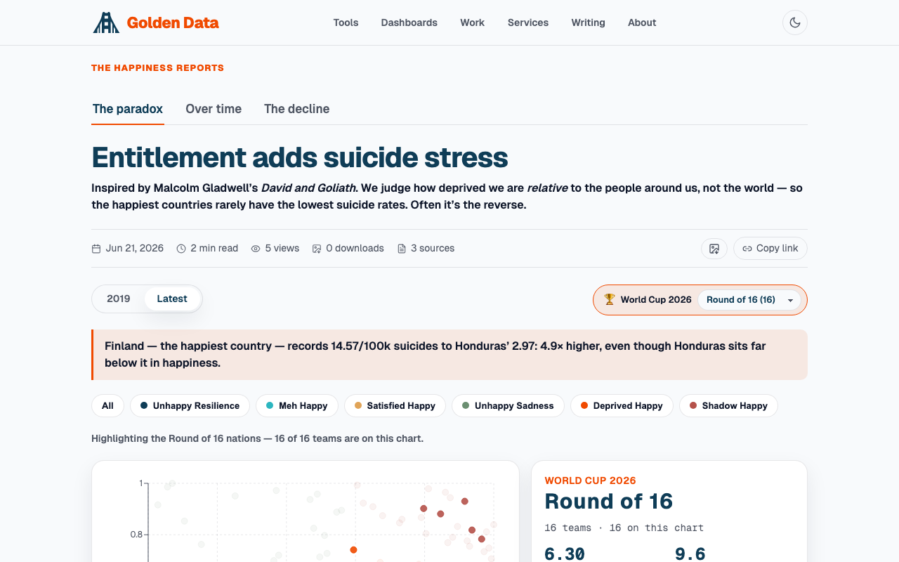
The Happiness Reports
Wellbeing
Why happy countries carry high suicide rates, and a fall nobody noticed.
- Published
- Jun 21, 2026
- Views
- —
- Origin
- Tableau
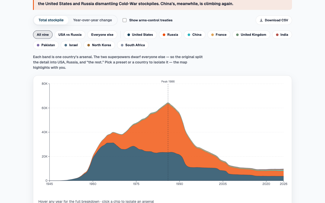
Nuclear Weapon Inventory
History
Every warhead since 1945: a 64,452 peak in 1986 and the 85% fall since.
- Published
- Jun 27, 2026
- Views
- —
- Origin
- Tableau
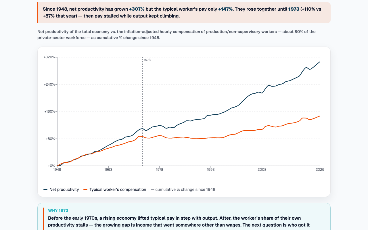
Productivity Has Left Wages in the Dust
Economics
Productivity up 298% since 1948, pay up 143%; the lines split around 1973.
- Published
- Jun 28, 2026
- Views
- —
- Origin
- Tableau
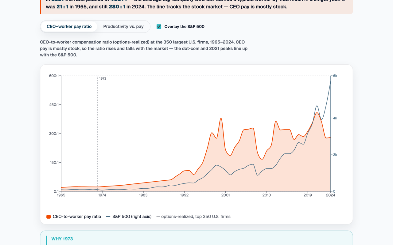
How Far CEO Pay Pulled Away
Economics
21 times a typical worker in 1965, 408 in 2021, swinging with the market.
- Published
- Jun 28, 2026
- Views
- —
- Origin
- Tableau
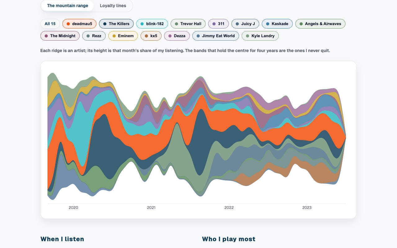
Topology of Music
Personal data
Every song since 2019 as a mountain range of loyalty to fifteen artists.
- Published
- Jun 23, 2026
- Views
- —
- Origin
- Tableau
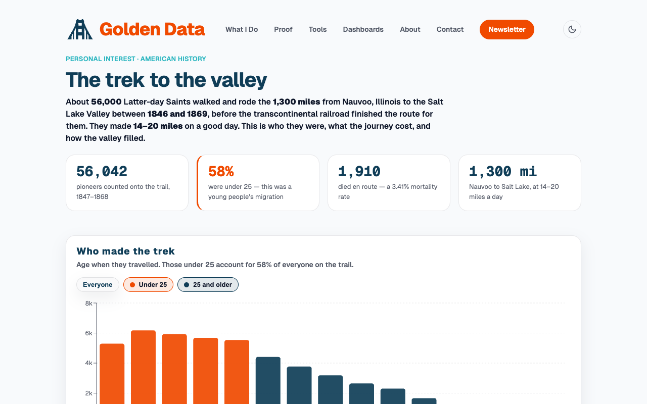
Mormon Pioneer Trek to the Salt Lake Valley
Faith
56,000 Saints, 1,300 miles, cholera, and a U-shaped mortality curve by age.
- Published
- Jun 23, 2026
- Views
- —
- Origin
- Tableau
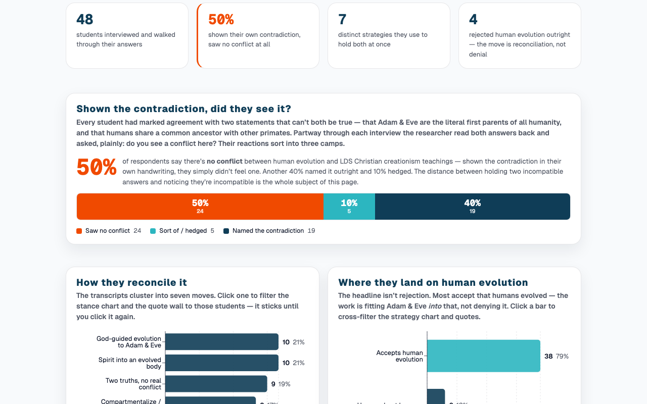
Faith and Human Evolution: Mental Gymnastics
Faith
Forty-eight religious students holding Adam & Eve and apes at once.
- Published
- Jun 23, 2026
- Views
- —
- Origin
- Native
More coming
The back catalogue is deep — economic trends, college ROI, NBA stats. They land here as they get ported.